Friday, 4 November 2011


Main Task: UNMANIPULATED PHOTOS
 This is an image that i thought i would use on my double page spread. The reason why i didn't use it was because i was planning to put the text inbetween the models hands, as speech marks- but if i did that the text would be covering their faces, which would not be ideal.
 This is another image that i did not use. I chose not to use this image because whilst experimenting with different poses done by the model, the lighting was affect. The pose was having a focus on the models hands in the lense, but then the lighting focused on the hand and not the models face.
 This is the image that i used for my front cover. The reason why i have used this image is because the lighting and the quality is quite good and it clearly shows the representation of the social group that i am trying to portray.
 This is another image that i used. i used this image on my double page spread. The reason being is because her body language supports the genre of the magazine. It also appeals to the target audience as it links with the colour scheme of the magazine.
 I also used this image because I did not want to just focus on one gender group. I wanted to attract to both, so i included male model.
 To back up my points about appealing to a range of ethnical groups, i have also included a range of different raced models. E.g white


Main Task: AUDIENCE RESEARCH
Taking all the responses that i have collected from my target audience, it has helped me to have a genreal idea of what they are expecting it to look like and what will be fetured.
The majority of the people suggested that the genre that i should focus on is hip pop and r and b. i also asked them how much they would be willing to pay and the feedback i got was mostly around £2. So the price i have decided to use is £1.50.
And lastly i asked what colours they would like and most of them liked vibrant and attracting home colours.
Below are some examples of people that i asked out of 20 people:


Main Task: CASE STUDY OF A PUBLISHING HOUSE

The publishing house that I have chosen to publish my magazine is Conde Nast Digital. Conde Nast Digital is an international publishing corporation that publishes magazines such as: Glamour, Vogue, GQ, Vanity Fair, Traveller, Brides and AD.
Moreover Conde Nast mainly focuses on women aged 18 and upwards and fashion and home. However they also publish men magazines such as G&Q and G&Q style, however they publish a variety of magazines which allows them to attract a wide range of a target audience.
Conde Nast Digital like to take interests in clients that may want to unite with their publishing house, in order for them to have an increase in the target market. For example, my magazine is a Hip hop and R&B music magazine. Conde have not yet got a segment on music that they publish for therefore a client like myself would find it easy to gain reputation, as there would not be any competition.

The selected target audiences that are being targeted by the example magazines vary. The reason being is they are not all focusing on the same genre so there are various target audiences:
Ferrari – ‘distributed to Ferrari owners and enthusiasts’ for that reason their target market is people who own a Ferrari and may be focusing on the upper class market; also for people wanting to purchase one. Clydesdale and Yorkshire Banks Journal- This magazine is targeted at people in business and people who are inspired to go down the same root and is only published twice a year.Condé Nast K magazine- This is the publishing house very own magazine and is aimed at people who are involved in travel and tourism and are interested in lifestyles and fashion around the world. Selfridges- This is a magazine target at their consumers and it will be published with other popular titles and is aimed at a lot of people.Condé Nast Digital only focuses on publishing magazines. I am aware of this because on their website, on the home page is says
Ferrari – ‘distributed to Ferrari owners and enthusiasts’ for that reason their target market is people who own a Ferrari and may be focusing on the upper class market; also for people wanting to purchase one. Clydesdale and Yorkshire Banks Journal- This magazine is targeted at people in business and people who are inspired to go down the same root and is only published twice a year.Condé Nast K magazine- This is the publishing house very own magazine and is aimed at people who are involved in travel and tourism and are interested in lifestyles and fashion around the world. Selfridges- This is a magazine target at their consumers and it will be published with other popular titles and is aimed at a lot of people.Condé Nast Digital only focuses on publishing magazines. I am aware of this because on their website, on the home page is says

‘Condé Nast is the world’s leading publisher of upmarket glossy magazines. Our Contract Publishing division works with a number of clients to create beautiful customer magazines that rise above the sea of marketing material received by today’s consumer. We use our editors, creative directors, photographers and writers to create bespoke magazines and coffee table books for hotel groups, retailers and luxury goods houses. We won’t compromise our standards for anybody’, which tell me that they only specialise in beautiful customer magazines and so on therefore my evidence has proved that this all they specialise in which is contract publishing.
Main Task: PROFILING YOUR AUDIENCE

The typical ******* Reader: Mark and Micheal, both 18, they love RnB, Hip Hop and Rap. The music they listen too has a massive affect on their everyday lifestyle and the way they dress. The way they dress is quite vibrant and current, the people he hang out with and the places he goes also reflect the lifestyle of the genre of music. They connect with their music everywhere they go and for most of their lives, even when they are asleeps. They attend wild parties and concerts. Any Hip Hop, RnB and Rap songs that come out they have already downloaded and added it on thier playlist immeadiately. Mark and Micheal also own modern technology such as ipods, phones and laptops. The always have music to listen to whilst they are on the go. Mark likes to inform his friends and express himself about anything new and Micheal uses applications such as Tumblr, BBM, Youtube and Twitter. Even though they are really passionate about the music industry, they have other hobbies such as watching tv, dancing, playing sport and going to parties.
Main Task: DOUBLE SPREAD TEXTUAL ANALYSIS

Denotation:
This is an example of a double spread page in a magazine, the image that has been used was a picture of Eva Mendes looking seductive at the audience which is a long angle which connotes power. The image also breaks the stereotypes of women because of the way she is dressed, which is quite masculine this again connotes power.
Mise En Sence
Lighting:
The lighting used is quite high key as you can see every feature of her.
Costume:
In the picture, she is wearing a smart shirt buttoned up to the top and a tie. This is subverts the generic conventions of women as a stereotypical woman would be in dresses. Also because the shirt is clean this would support the stereotypes of women being clean and connotes successfulness, because if she was in a dress, you would think she was going to a party.
Props:
There are no props shown in the main image but there are two smaller images on the double page spread. In the one on top right, there is a perfume bottle which shows she is advertising a perfume. The other image on the second page at the bottom left shows she has jewellery in her mouth.
Setting:
The background is a plain white background to keep the audience focused on her. It also goes with her outfit.
Non-verbal communication:
In this image, the nvc shows that she is holding her tie with her mouth slightly open and is looking down at the audience at an angle which connotes power and domination. The way she holds her tie connotes she is still trying to be seductive but confident.
Target Audience:
Considering all the the points made, the target audience would be 20-40 year olds, but mostly females as only women would be interested in information and a interview with ‘Eva Mendes’. As this target audience will be interested in Eva Mendes and feminine stuff like this to use in an everyday life.
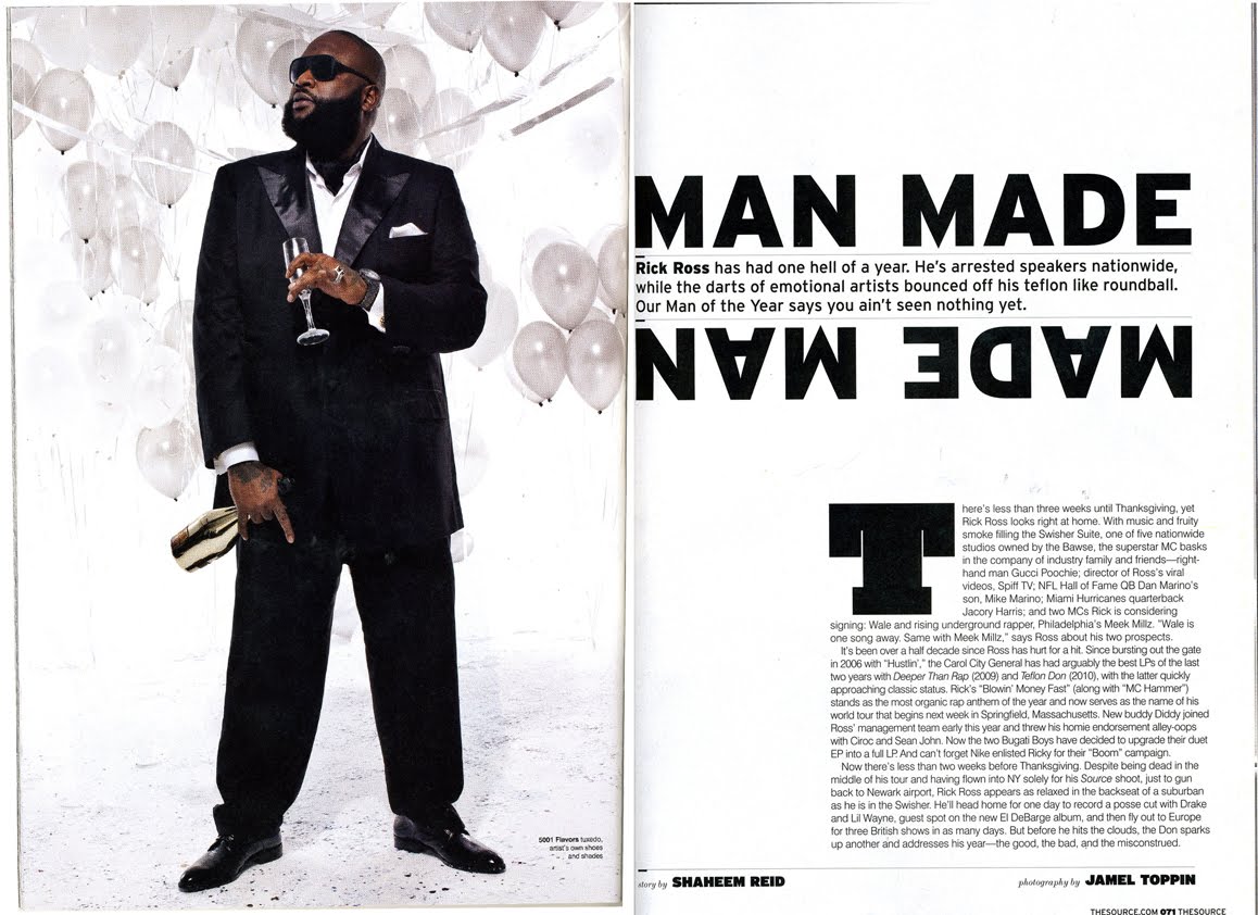
Denotation:
This is another example of a double spread page in a magazine, the image that has been used is a picture of the successful American rapper 'Rick Ross' looking smart and looking away from the camera using a long shot show his whole body, which connotes domination. The image also supports the stereotypes of men because of the way he is dressed, which is quite authouritive this again connotes power.
Mise En Sence
Lighting:
The lighting used is quite high key as you can see every prop and his nvc clearly.
Costume: In the picture, he is wearing a smart suit which is slightly unbuttoned. This is supports the generic conventions of men as a stereotypical man would be in a suit to look like a boss.
Props: There are ballons, wine bottle and a glass cup that are shown in the main image connoting that he is quite masculine. But the fact that he is drink wine and not beer connotes that he is quite wealthy.
Setting: The background is a plain white background to keep the audience focused on him. It also goes with his outfit. The fact that he is wearing a black suit ontop of a white background also makes it possible for the audience to stay focused on him because he stands out.
Non-verbal communication:
In this image, the nvc shows that he is holding a wine bottle in one hand and a glass cup in another. The fact that he is standing assertively connotes power and domination. The way his hands also make a gesture connote that he is confident.
Target Audience:
Considering all the the points made, the target audience would be 16-30 year olds, but mostly males as men would be interested on information and a interview with ‘Rick Ross'. As this target audience will be interested in how a rapper would live his lifestlye.
Main Task: FRONT COVER TEXTUAL ANALYSIS

Denotation: The magazine cover contains a colour image of a woman having eye contact with the audience in the right eye whilst the left eye is looking through a camera. It is a medium long shot revealing her head, arms and waist. She is standing up and just showing her waistline as she poses in the shot. Behind her is the Vibe Masthead, and in front of the main image are five groups of coverlines in black, peach, blue and white. The woman’s name is in blue on the top right underneath the Masthead so that it stands out. The barcode is on the bottom left corner. Masthead: Vibe masthead is quite bold and professional: the colour of the font is dark peach over a lighter peach background. The font is a san serif font. You can tell because it is quite plain and distinctive. The word ‘vibe’ comes from the 1960’s and is a slang that means atmosphere or feeling. The fact that the title of the magazine is colloquial language gives the impression that the magazine is a hip pop/r&b/rap magazine because those genres mostly use colloquial language. Character: The main image is a photograph of the famous, successful American Janet Jackson. Composition: She is posed in quite a seductive but youthful way as she is tugging on her jeans and her facial expression. The fact that she is holding a camera shows creativity and confidence. Costumes: Her clothing is a white tank top revealing her arms, a sort of string vest beneath and a pair of denim jeans. She has also accessorized the outfit with some jewellery; rings and bracelets. The clothing is to make her look natural but still seductive. The outfit also makes her look quite youthful, this is because teenagers normally wear those types of outfits. NVC: Her nonverbal communication is also playful. Her mouth is open showing some white teeth and direct address is used as she looks at the camera. Lighting: The lighting is quite bright, as her skin is glowing. Setting: There is no setting; however the peach background connotes a studio as she is holding a camera. The picture may have been taken as she was taking a photo of something. Coverlines: The main coverline that is involved with the main image says: ‘Janet Jackson Likes to Watch’. This is in relation with the camera she is holding in the main image. The different coverlines advertise to us that the magazine does not only talk about one celebrity, but also talk about the past and future of hip pop/ rap/r&b as well as the present. The other music artists advertised are Jermaine Dupri, Erykah Badu, Rihanna, Mario, Tupac, Run Dmc, J.Lo, Dr. Dre, Bobby Brown, Lil Kim, Diddy, Angel Lola Luv and Beastie Boys. The arrangement of the coverlines expose what will be in the magazine. All these coverlines are san serif, supporting the generic conventions of how magazines should be made. Target Audience: Taking into consideration all of these topics, the expected target audience could possibly be people (both male and female) aged 16-35. This is because of the genre of the magazine. Making it inly appeal to only a segment of the population.

Denotation:
The magazine cover contains a colour image of a man having eye contact with the audience. It is a medium long shot revealing his head, arms and waist. He is standing up and just showing his waistline as he poses in the shot. Behind him is the Vibe Masthead, and in front of the main image are five groups of coverlines in red and white. The man’s name is in white on the top right underneath the Masthead so that it stands out. The barcode is on the bottom left corner.
Masthead:
Vibe masthead is quite bold and professional: the colour of the font is red over a black mosaic background. The font is a san serif font. You can tell because it is quite plain and individual. The word ‘vibe’ comes from the 1960’s and is a slang that means atmosphere or feeling. The fact that the title of the magazine is colloquial language gives the impression that the magazine is a hip pop/r&b/rap magazine because those genres mostly use colloquial language.
Character:
The main image is a photograph of the famous, successful American Trey Songz.
Composition:
He is posed in quite a seductive way as he is standing quite assertive and his facial expression is quite serious but promiscuous.
Costumes:
He is hardly wearing any clothing, but the little that he is wearing is Calvin Klein boxers. There is hardly any clothing so that he can attract the right target audience is to make her look natural but still seductive. The outfit also makes her look quite youthful; this is because teenagers normally wear those types of outfits.
NVC:
His nonverbal communication is also stern. His eyes are looking straight at the camera and has his eyebrows frowned.
Lighting:
The lighting is quite bright, as his skin is reflecting the light.
Setting:
The black background connotes a bathroom scene as he is dripping wet. The picture may have been to make him look dominant and seductive.
Coverlines:
The main coverline that is involved with the main image says: ‘Trey Songz, Hardest in R&B’. This is in relation with the fact that he is topless to make him look like he has authority over the music genre: R&B. The different coverlines advertise to us that the magazine does not only talk about music, but also sport: ‘Gambling in NBA’- Basketball. The other music artists advertised are Buju Banton and Young Jeezy. They also talk about news around the world; ‘Haiti-Survival Story’. They also give advice to their audience: ‘4 ways to wear a suit.’ The arrangement of the coverlines expose what will be in the magazine. All these coverlines are san serif, supporting the generic conventions of how magazines should be made.
Target Audience:
Taking into consideration all of these topics, the expected target audience could possibly be people (both male and female) aged 16-35. This is because of the genre of the magazine. Making it only appeal to only a segment of the population. It could appeal to women because of the main image of Trey Songz making women intrigued. Also it would appeal to men because of the coverline, ‘4 ways to wear a suit.’ This backs up the point of men reading the magazine because suits are worn by men.


Main Task: INTRODUCTION

My name is Ife Akande and I am studying AS Media Studies.The task I will be doing is to create a Front Page, Contents Page and Double Page spread for a new original music magazine. The magazine will be focusing on only Hip-Hop/RnB genre. I have chosen this genre becuase i am more familiar with it and I listen to this type of music which would beneifit me.


Induction: MOVIE POSTER TEXTUAL ANALYSIS

Textual Analysis: Empire Movie Magazine Front Cover.
Denotation:
The magazine cover consists of a coloured photography of a robot having eye contact with the target audience. It is a mid long shot showing only the robots head, shoulders, arms, chest and waist. It is clear to the audience that the robot is standing up. The main background of the magazine is black. However, it seems that the light from the electrifying masthead, ‘Empire’ is reflecting on the background to give it a contrast of black and blue. Also the image of the robot covers the majority of the magazine cover. Behind the robot is the ‘Empire’ Masthead, and in front and beside him are six coverlines in grey, blue and white. The main subjects name is in white with a blue border and there are coverlines in boxes so that they stand out from the rest. A barcode is visible at the bottom right corner.
Masthead:
The ‘Empire’ masthead is very distinguishing: white with a blue lightning border with a baby blue drop shadow. The font used is a san serif font, and underneath each letters there is an underline of lightning. The font/style connotes authority and power. The word ‘Empire’ means a group of nations, states, or peoples ruled over by a powerful sovereign giving a suggestion that the magazine is a powerful sovereign over other movie magazines. ‘Empire’ is known for providing their target audience with vital information they need for movies.
Character:
The cover image is of someone in a costume of a robot. However the magazine did not make the target audience aware that in the costume it is the successful American actor ‘Robert Downing Jr’.
Costumes:
The costume is a sci-fi themed outfit of a robot. This is so that the target audience are aware of what the movie will be about.
Coverlines:
The main coverline that relates to the photograph says: “Iron Man 2: new suit, new enemies, and same attitude”. This is making a reference to the narrative of the movie. The fact that the movie is called “Iron man” supports the stereotypes of men always being the hero and being dominant. This also always the audience to know that the hero is a man. There are also three coverlines at the bottom of the page notifying the audience what else will be included in the magazine.
Target Audience:
Considering all of these points, the likely target audience would be people (mostly male and a minority of females) aged 16- and upwards. They would have good understanding of action movies and definite interest in a wide range of movie genres as a whole. They are likely to have an imagination and have a general interest in movies.
Induction: RE-CREATION OF A MOVIE MAGAZINE FRONT COVER

For the induction task, I recreated the front cover of a movie magazine, using Photoshop. I was given a magazine cover of Iron Man and an image similiar to the original and i had to recreate it to look as similar as the real one.
This was the image that i was given to recreate the magazine cover.

this is the orginal magazine cover that i had to duplicate.

Subscribe to:
Comments (Atom)